Accessibility
23 November 2023
Accessible design is the process of ensuring that digital products are inclusive and user-friendly for everyone. This can be achieved by implementing a number of design practices to accommodate the different impairments that users may have. These practices determine the level of conformance that a product adheres to: A (lowest), AA (mid range), and AAA (highest).
Like the many different types of users, there are best practices to consider for each of the different impairments when designing digital products. These vary based on whether a user is on the autistic spectrum, requires the use of a screen reader, has poor vision, have physical or motor disabilities, are deaf or hard of hearing, or have dyslexia. Below are some examples that I have used in the past to accommodate each of these scenarios.

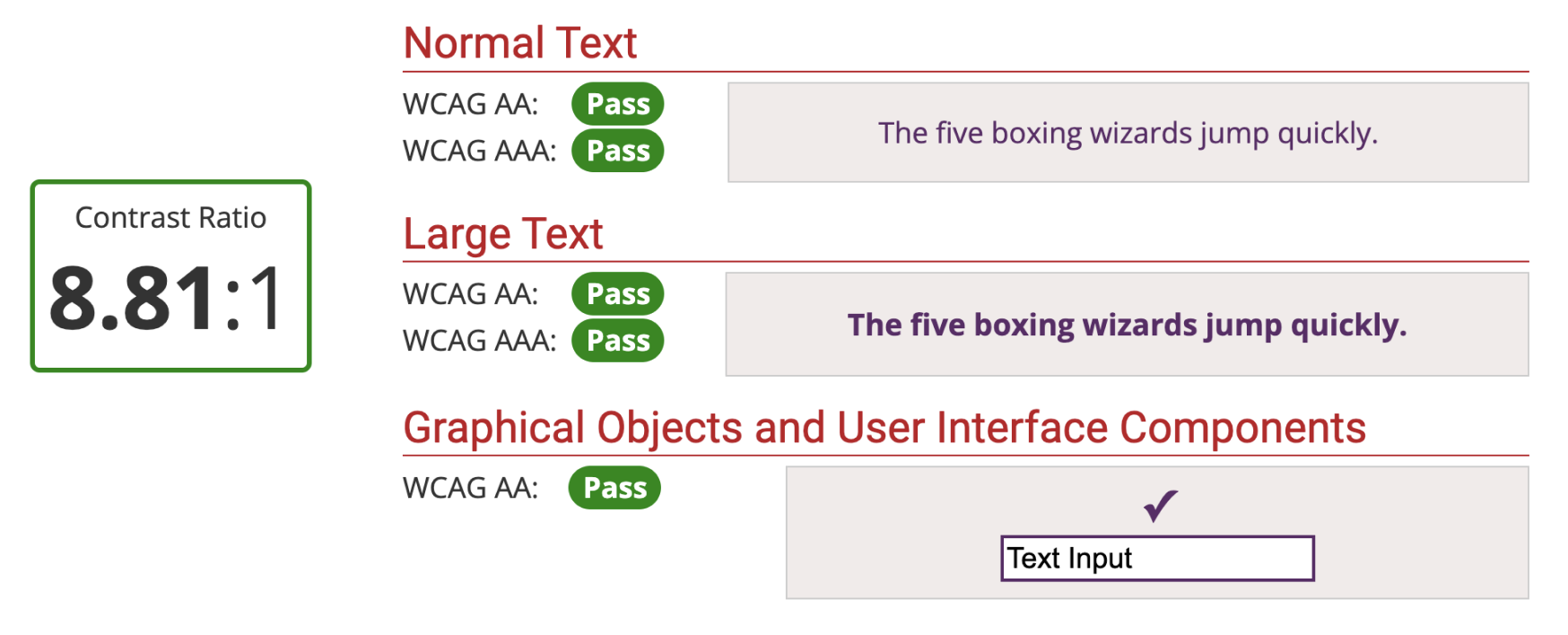
Working at Giki, we were committed to delivering an AA level of conformance which meant certain standards had to be ensured. Colour contrast, for example, plays a large role in people’s ability to perceive the information on a page. While it’s best to avoid sharp and bright colours for those with autism, it is also important to check the contrast between the background and foreground for users that suffer a colour vision deficiency. This applies to text of different sizes as well as graphical objects and user interface components which can be checked via an Online Colour Checker. This will help determine if the contrast between the colours is above or below the recommdended minimum of 4.5:1.
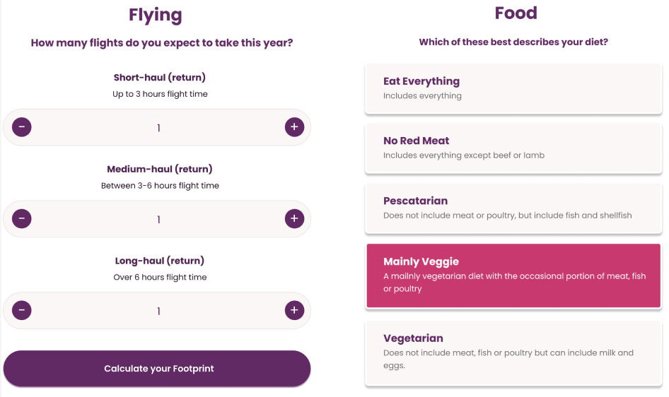
The British government have provided great resources that can be found here that demonstrate all the different ways you can design with accessibility in mind. Several of these best practices have been put in place in the designs below, from descriptive buttons, using large and clickable actions, keeping content short and clear, as well as strong colour contrast.


