Above the Fold Design
21 December 2023
The term ‘above the fold’ originates from print media at a time when newspapers were folded before being placed on the newsstand. This led to a trend that is still being followed to this day, where publishers began placing the most eye-catching headlines above the fold in the hopes that it would grab the attention of passersby. In modern day product design, we have adopted a similar approach for all content that is visible when the page first loads. We do this to improve conversion rates as well as the overall user experience by helping the user to find what it is they are looking for. This is why any content that appears off the screen should be considered of less importance or ‘below the fold’.

With digital products, we have the added complication of screens existing in all shapes and sizes. This is where analytics can be used to determine what brands and devices are most frequently used to access your product. If this is not possible, market research should be carried out on similar products to help narrow this down.
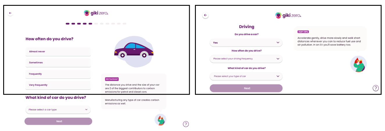
In the example shown above I have taken the browser bar and start menu into account to demonstrate how much space the browser and operating system dominate on the page.

Through AB testing, designers are able to determine which layout will produce the highest conversion rate. This is achieved by experimenting with different layouts and comparing the conversion rates of each to see which produces the best result.
In the above design you can see how I have determined the level of importance of the fun fact to be higher than that of the feature image, but of lower importance than the questions. By removing the image altogether, I have ensured that the fun fact will remain above the fold on desktop and have decreased the scroll time on mobile. I have also removed the dominating progress bar and updated the questions to use dropdown menus instead of lists.


